
𝐃𝐢𝐬𝐩𝐥𝐚𝐲 𝐚 𝐥𝐢𝐧𝐞 𝐂𝐡𝐚𝐫𝐭 𝐟𝐨𝐫 𝐭𝐡𝐞 𝐭𝐨𝐭𝐚𝐥 𝐬𝐞𝐥𝐞𝐜𝐭𝐞𝐝 𝐝𝐢𝐦𝐞𝐧𝐬𝐢𝐨𝐧𝐬 within 𝐚 𝐜𝐨𝐦𝐩𝐚𝐫𝐚𝐭𝐢𝐯𝐞 𝐚𝐧𝐚𝐥𝐲𝐬𝐢𝐬 𝐬𝐜𝐞𝐧𝐚𝐫𝐢𝐨
Lines Chart to compare Sales of Multiple channels

In this blog article, the purpose is to describe how to display a line chart with separate lines for each sales channel and add a line for the sum of all selected channels.
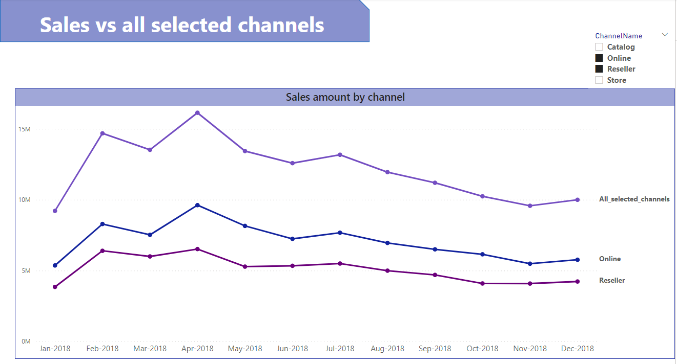
In this example, if we select the “Online” and “Reseller” channels, the line chart will display a separate line for each of them + a line for their totals.
Set-up steps:
In order to create separate lines for each dimension , we need to drag the "Dimension"field , (the channel_name in our case) to the "Legend" section of the line chart visual, but to add a line for the total of the selected channels we can go through these steps:
Create a calculated table included the channels values + a value for the all selected channels
Channels_connected_table =
UNION(
    DISTINCT( dimChannel[ChannelName]),
    {"All_selected_channels"}
)
Connect the created table to the dimension “dimChannel” table
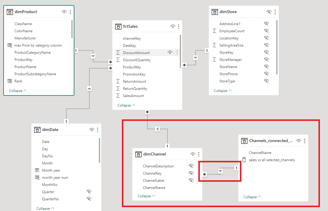
Set its relationship to One to many, making the "channels_connected_table" filter the "dimChannel" table.
Use the “channel name” column from the "channels_connected_table" in the legend of the line chart
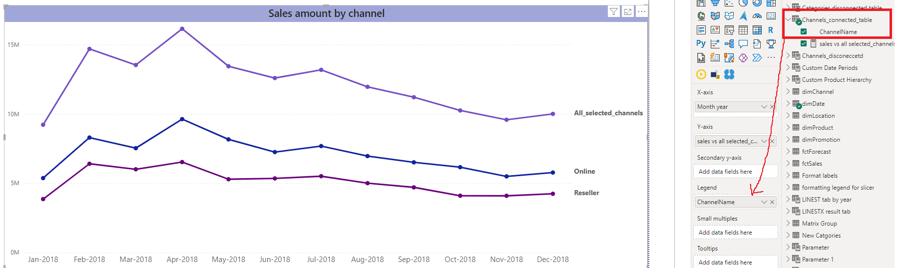
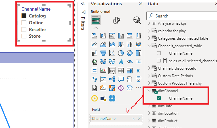
Add a slicer that will contain the channels from the dimension table “dimChannel”
Then modify the sales amount measure to include the result for all the selected channels:
sales vs all  selected_channels =

var selected_chanels= ALLSELECTED(Channels_connected_table[ChannelName])

return
IF(SELECTEDVALUE(Channels_connected_table[ChannelName])="All_selected_channels",
CALCULATE([Total Sales], Channels_connected_table[ChannelName] in  selected_chanels),
[Total Sales])
For each channel value in the "channels_connected_table", the DAX measure will calculate the amount of sales based on the channel selected from the slicer of the dimension table, and for the "All_selected_channels" value, it will calculate the total sales amount for all selected channels items .
=> Result: lines for each selected channel and a separate line showing the sum of sales for all selected channels.
Now, the line chart should display individual lines for each selected dimension (channel name), as well as an additional line representing the total sales across all selected dimensions. This will allow you to compare the performance of individual dimensions with the overall total sales trend.
👉To find out more, I invite you to watch the video of Bas from How to Power BI YouTube channel, which is very detailed, helping you to use this trick in comparison scenarios.