
Highlight values, Smart narrative, Great Power BI storytelling technique

I just tested the technique shared by Ruth from Curbal, using the smart narrative to do storytelling in Power BI in order to capture the user's attention and deliver insights more effectively.

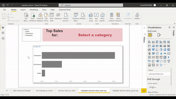
The goal is to highlight the selected categories.
In a bar chart it's easy since it includes conditional formatting allowing us to do it flexibly.
But to highlight selected categories and color them differently in a Text Box, it's a bit limiting, so we have to find a way to do it:
First I tested a bad method which is to put the dynamic measure that returns selected categories, in a card visual and place it next to a text box containing the title:

👎Having to load many visual elements will slow down the performance of the rendering time of my report page and make it more difficult to maintain.
the second approach is to use the smart narrative visual, including the measure that displays selected categories, then color it differently:


👍Using smart narrative to highlight values, meets my need in this case, it is particularly suitable when we want to have other types of visuals that do not support conditional formatting in Power BI.
Steps:
Create a disconnected table to be used in the categories slicer
Create a measure to be used in the conditional formatting of the bar chart:
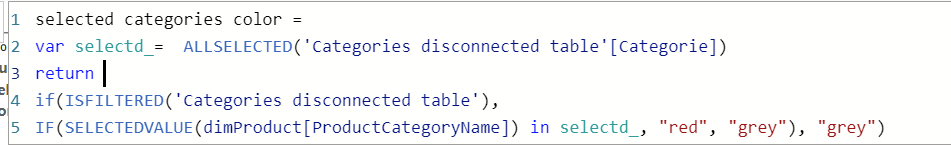
Create a measure that retrieve the selected categories to be displayed in the smart narrative visual

